Hello!
Lately, I’ve noticed a growing trend on social media: beige has become the design world’s favorite color to criticize.
Many of these conversations position beige as the opposite of creativity, personality, or vibrance, insinuating that ‘beige interior design’ or a neutral palette automatically creates a lifeless space. While I understand the argument, I believe it oversimplifies a much deeper conversation about how our environments influence the way we feel.
As holistic interior designers, we believe great design is never about following trends or choosing sides between color and neutrals. Instead, we ask a different question:
How do you want to feel in your space?
When viewed through that lens, both bold color and non-color have an important role to play. It’s less about which hues are used, and more about intentionality.
So just for fun, this month I’d like to make a case for beige interior design. Keep reading. The receipts may surprise you!
Sending you lots of 💛,

"BEIGE" INTERIOR DESIGN AND OUR CONNECTION TO NATURE
When we approach a space through a holistic lens, we recognize that our minds, bodies, and nervous systems are deeply connected to the natural world.
This is the core principle of biophilic design: a design practice that seeks to strengthen our connection to Nature because of the positive effects it has on us.
Biophilic design does not just mean buying a bunch of green houseplants, putting them in a corner, and calling it a day. In our work, it goes so much deeper than that. And ‘beige’ plays an important role in this.
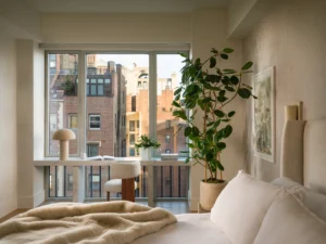
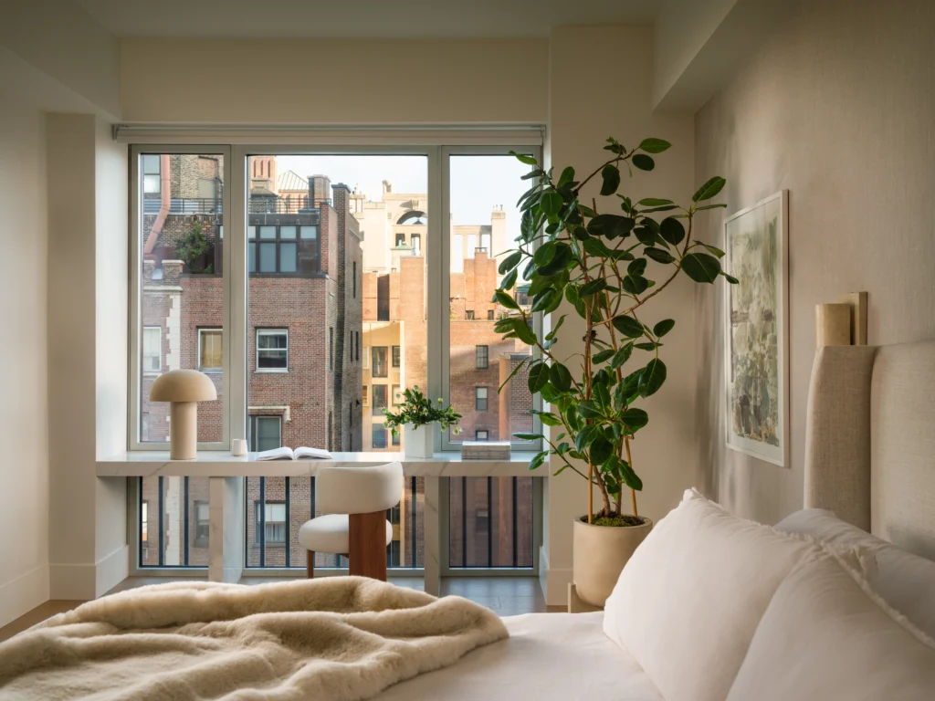
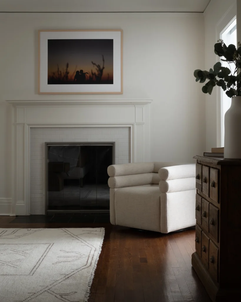
Beige isn’t a “lack of color,” it’s the color of organic materials like sandstone, driftwood, linen, and desert clay. These natural tones create a sense of calm and grounding that people respond to.
When layered thoughtfully through textiles, finishes, and natural materials, shades of sand, oatmeal, taupe, and ivory bring the natural palette of the outdoors in. The result is a space that feels authentic, supportive, and connected to Nature.
Creating Harmony Between Interior and Exterior Spaces
One of the principles we return to often is that your environment does not end at the walls of your home.
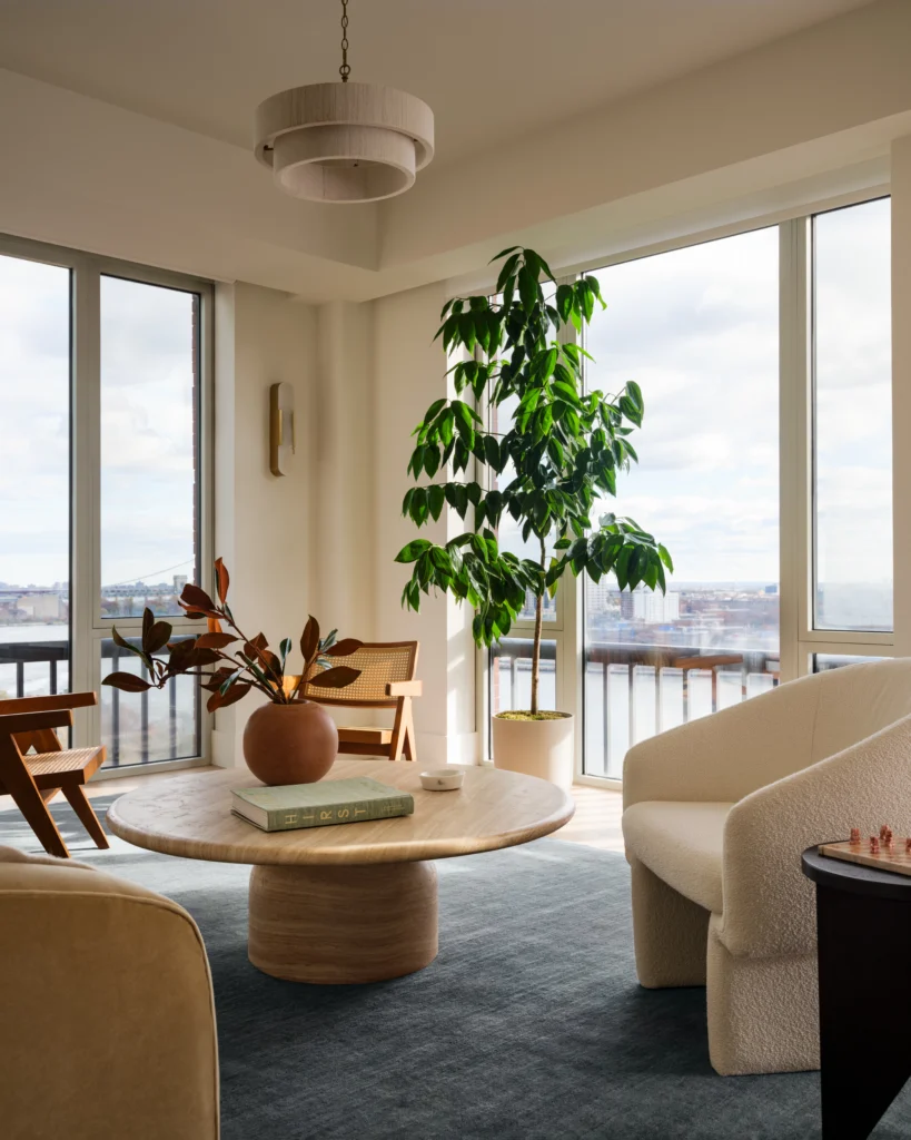
Every interior exists in relationship with what surrounds it. The trees outside your windows, the sky, the garden beyond your patio, and the natural light throughout the day all become part of the design experience.
When a home has beautiful views of Nature, a soft neutral palette acts as a quiet backdrop that allows those views to take center stage.
Rather than competing with the landscape, ‘beige’ interior design creates harmony between indoors and outdoors. We treat the view from the window as art, strengthening our connection to the natural world and encouraging a greater sense of presence.
In many cases, the most powerful design choice is not adding more visual stimulation, it’s creating space for what already exists outside to be seen, felt and appreciated more.
Why Neutral Interiors CAN Feel So Calming
Modern life is filled with stimulation.
We move between screens, notifications, busy schedules, and endless streams of information. For most people, the nervous system spends a lot of the day operating in a heightened state of alertness.
Our spaces should offer sanctuary.
While vibrant colors can energize, inspire, and activate a space, soft neutrals tend to create a quieter, more calm experience. Beige in particular brings a sense of softness that allows our minds and bodies to relax.
A thoughtfully layered neutral palette reduces visual clutter and creates an atmosphere that feels restorative rather than demanding. It signals to the brain that this is a place for rest, reflection, and recovery.
This is why so many of our clients are drawn to warm, nature-inspired neutrals. They’re not looking for a space that feels empty, they’re looking for a space that feels peaceful.
The Real Purpose of Beige
The conversation should never be about whether color is good or beige is bad. The real question is whether your space supports the life you want to live.
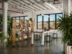
Sometimes that means embracing bold colors that energize and inspire. This is especially true for areas like an office, breakfast nook or play room. Other times, it means creating a sanctuary rooted in softness, simplicity, and connection to Nature, especially in spaces like bedrooms or living rooms.
The most important thing is not to follow trends and tap into what feels good and how you want the room to support you. ‘Beige’ interior design is not boring. When used intentionally, it becomes a powerful design tool. And in a world that asks us to be constantly “on,” there is something profound about a space that simply invites us to exhale.