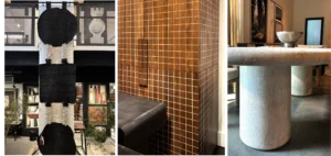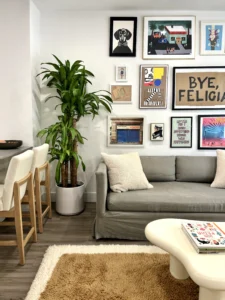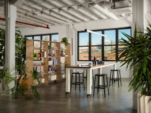
We’re starting the New Year off right and giving you a peek at two of our latest completed projects. The first is an office interior for NYC tech firm, Postlight. For this Client, we created a truly unique office space, as we replaced the traditional office with a space conducive to lots of collaboration, meetings, and holding events. On the residential side, we’ll show you a New York City apartment which we completely renovated, resulting in a warm, welcoming and relaxing retreat for all those who stay there. Read on!
COMMERCIAL INTERIOR DESIGN
OFFICE TOUR: POSTLIGHT
Designing Postlight’s NYC office was an exciting project for us. Not only are they an amazing, impressive, socially conscious company, but they were after something totally out of the box compared to most commercial clients. Specifically, they wanted to create more of a ‘Soho House’ vibe rather than a traditional office.
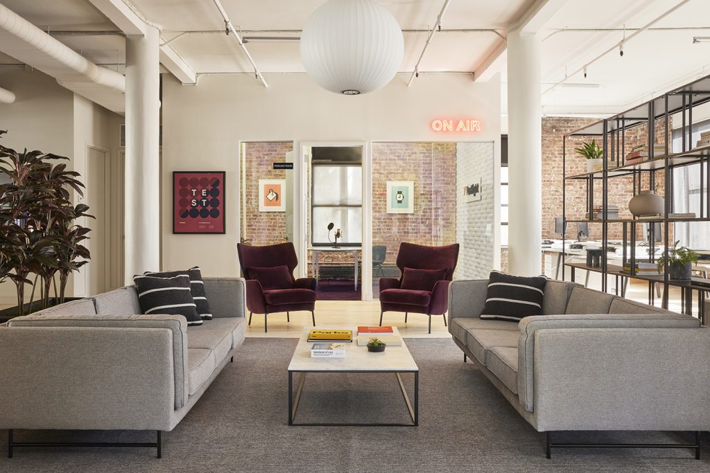
To achieve this, we pared down the number of traditional workspaces, and replaced them with comfortable seating areas, where employees would be able to work together in small groups, work alone, or even meet with a client. Of course this didn’t mean we would forego all quiet spaces where people could hold private meetings or work in silence. We revamped all enclosed rooms, and carved out space for phone booths in their new cafe style seating area. Most importantly, the space is perfect for holding events and presentations, as there is plenty of seating, but all pieces are modular and able to be rearranged to accommodate large gatherings.
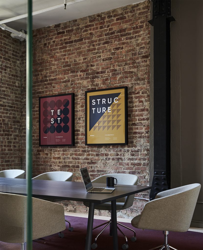
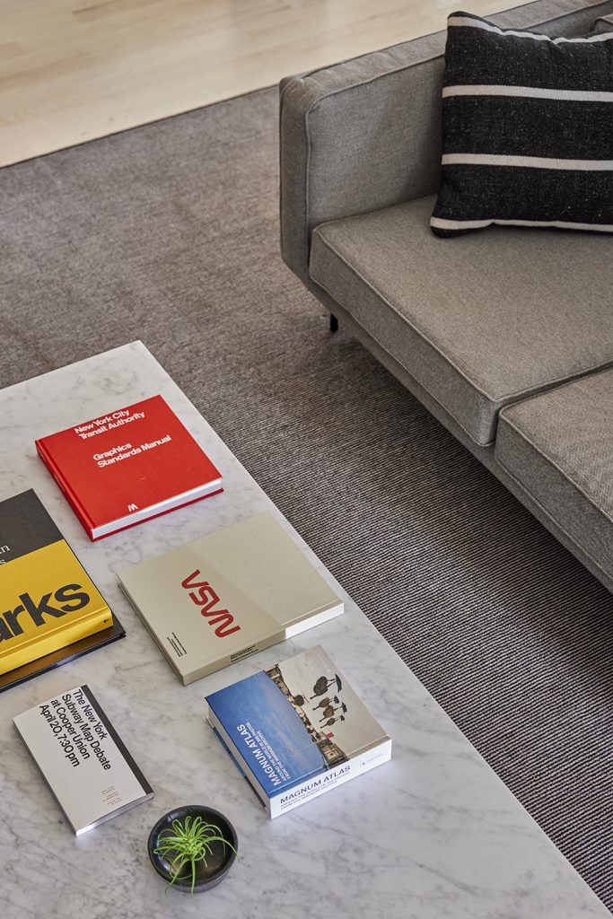
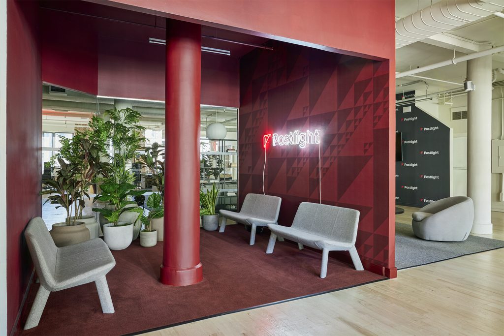
Another important piece of the puzzle was keeping the thread of the brand’s identity throughout. We did this by tweaking the red in their logo, and using it strategically within the space. Most notably, a monochromatic statement in the reception area – with wall to wall red, custom wallpaper which was a play on the triangle in Postlight’s logo, and lots of plants, we created a wow moment right where guests and employees enter the space.
For more photos and design details, click here.
RESIDENTIAL INTERIOR DESIGN
HOME TOUR: W 67TH STREET
Next up, we’ll take you on a tour of a total renovation for a New York City residential client.
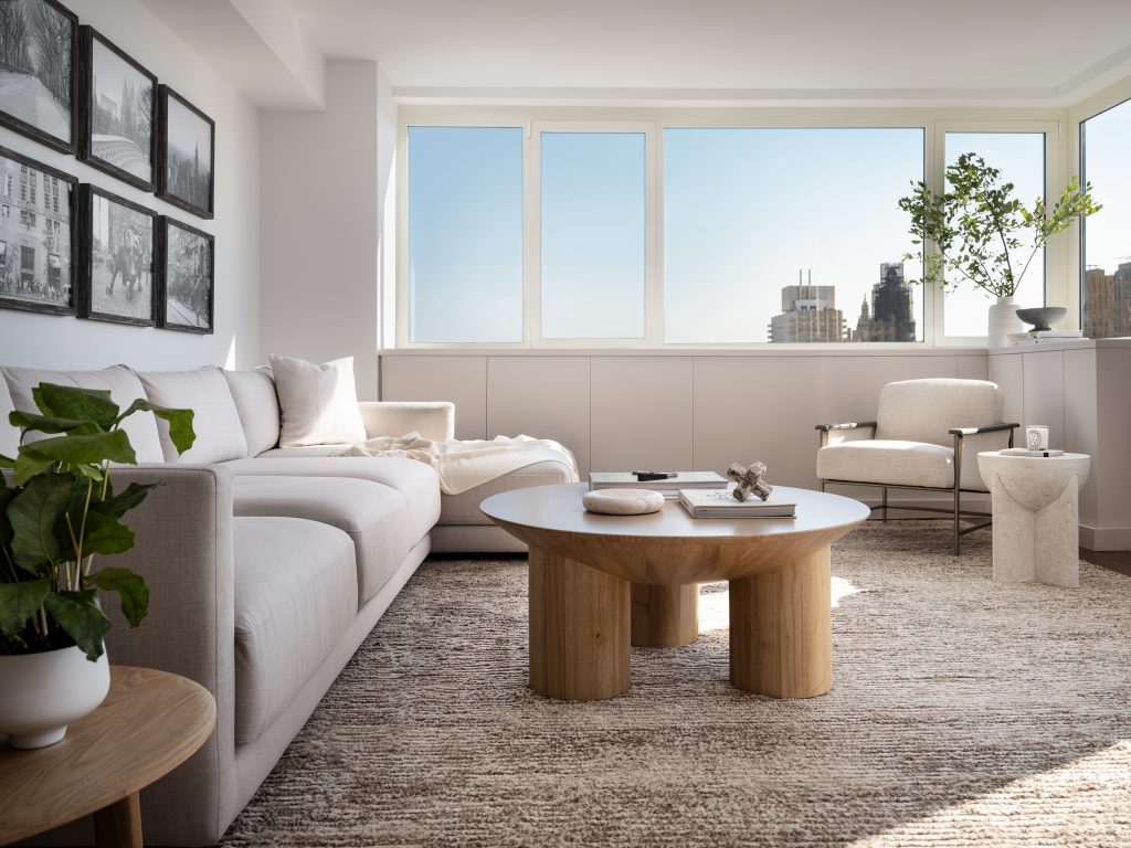
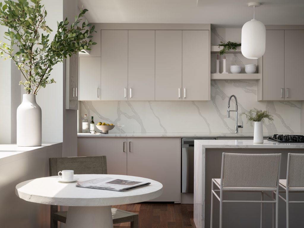
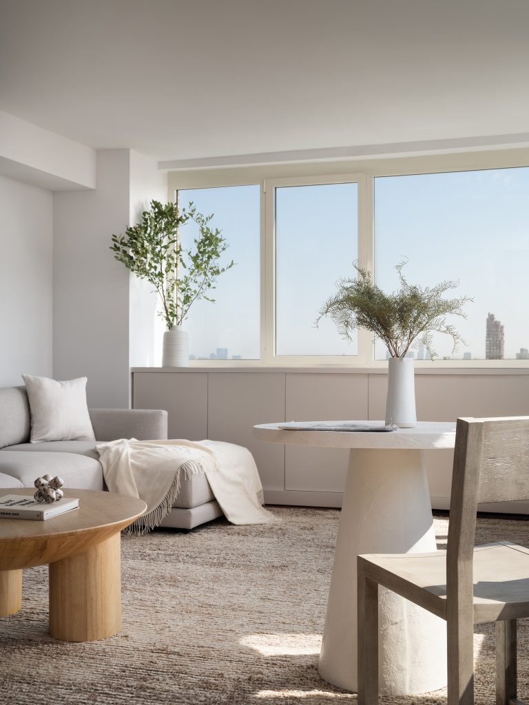
The goal was to create a space that felt totally calming, warm, and inviting. We employed mostly neutrals, with lots of organic shapes and tons of texture. As our client is also a major plant lover, we were sure to incorporate many throughout the space, as well as vases with lots of branches. We created a tonal look for the kitchen, with shades of gray and a half-waterfall marble countertop, with a backsplash to match.
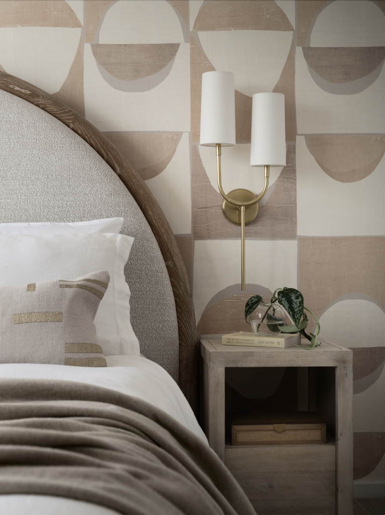
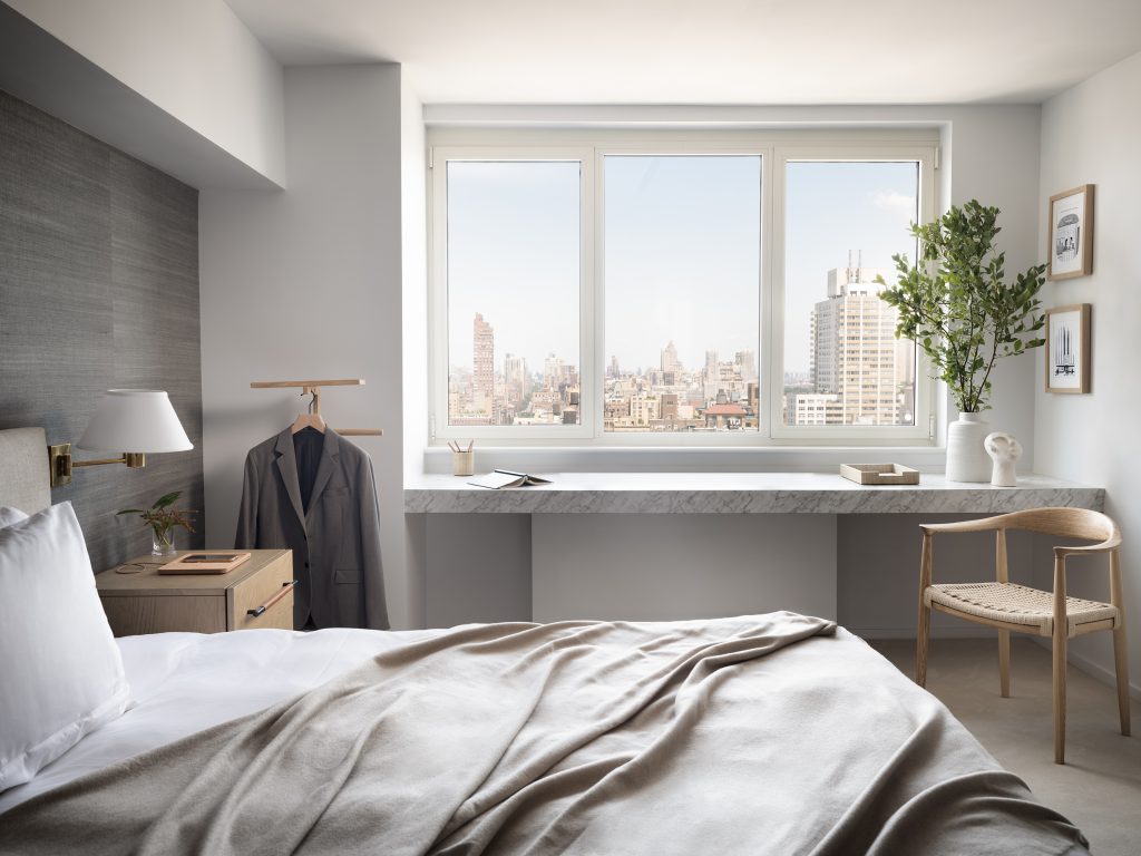
We went with two different vibes for the bedrooms. For the primary, we composed a more masculine space, with darker neutrals, including a textured seagrass wallpaper. For the guest room, we went a little more feminine and fun, with lots of curves from the wallpaper down to the headboard. Click here to see more!
Gala Magriñá Design works with clients that understand the importance of creating a beautiful space and want to work with a no-nonsense design team that is able to clearly chart the best way forward. What separates or approach from other designers is our extensive knowledge of how people live and how best to create a customized space that nurtures that. We aim to merge cool and beautiful interiors with a holistic, mindful and intuitive approach to design that results in powerful, healthy spaces that elevate and transform people’s lives. For more information please visit galamagrinadesign.com.

